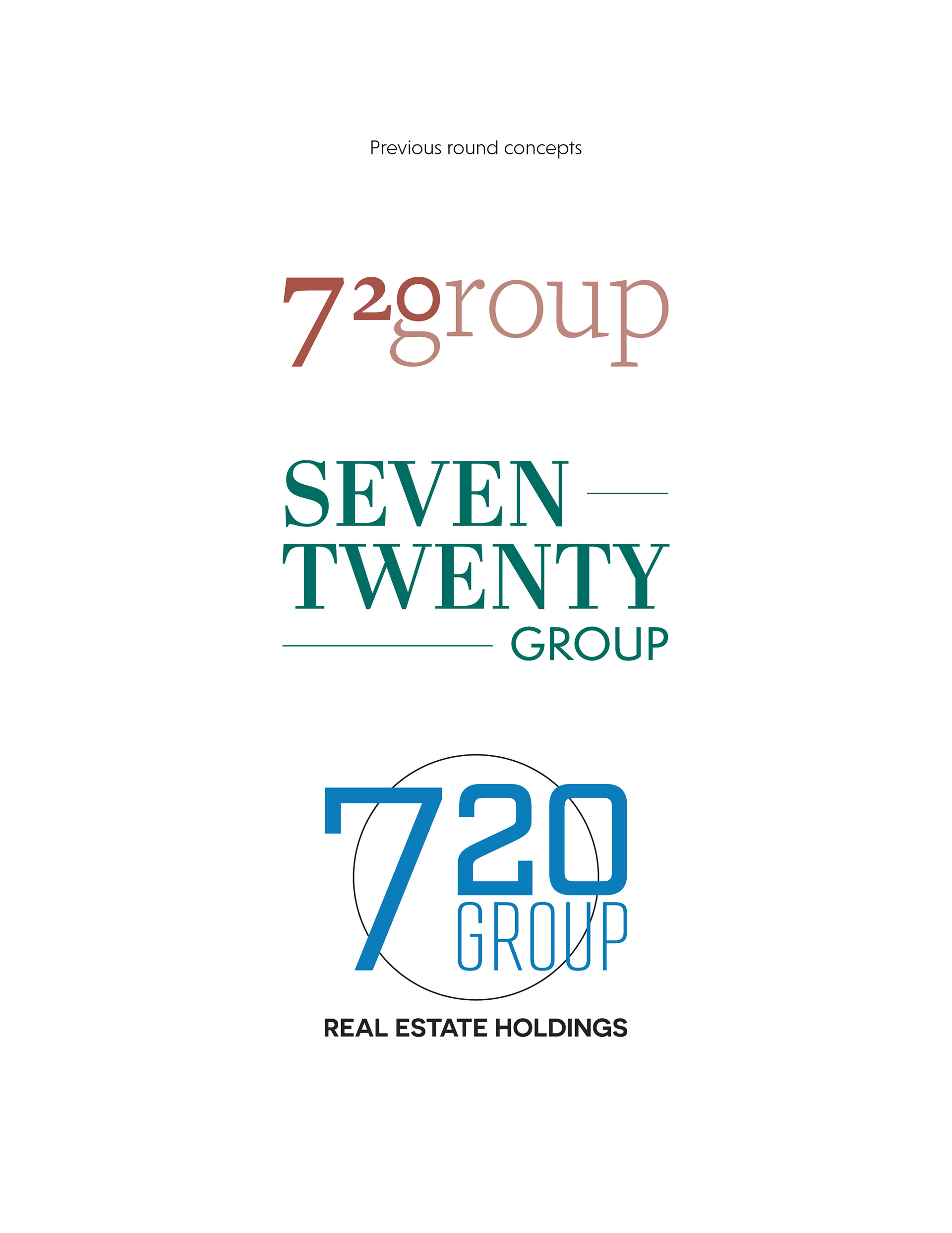
Logo and brand colors for a real estate holdings group. The client needed a logo that portrayed their experience in the industry—it had to feel trustworthy and classy, without being overly flashy. The client also requested a distinctive mark they could use across their brands and social media accounts.
In order to accomplish this, I aimed to create a logo that was a blend of styles without veering too far into any one direction. The logo feels fresh, simple and clean, but is unobtrusive and subdued. The serif typeface of the word mark feels classic, but is refined, simple and modern so it stands out without being overly loud. The brand colors also play into this—they are muted but striking and effective in catching one’s attention.
The icon is much more modern but blends well with the more traditional word mark. Taking inspiration from hotel key tags, it is a subtle play on those designs and allows itself to stand alone as a recognizable icon. Altogether, the logo comes together to present itself as an established and experienced brand.