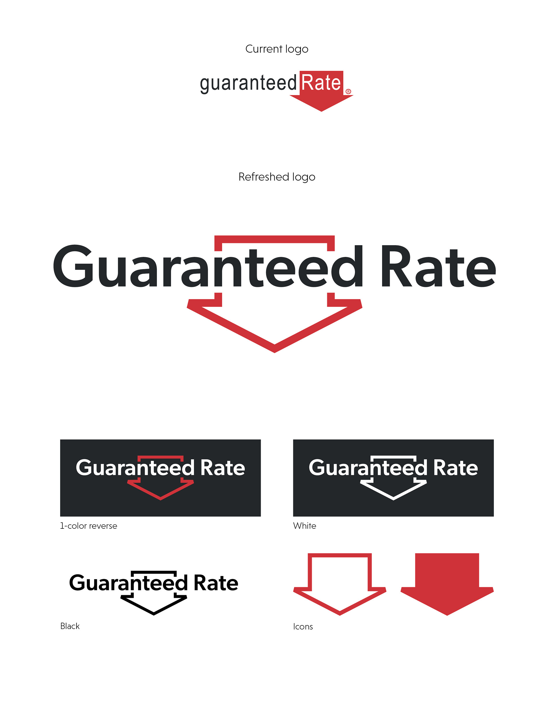
Developed during an in-house brainstorm, this is a refreshed concept of Guaranteed Rate’s logo. It was necessary for this logo to be a refresh and not a complete rebrand of logo. The primary brand colors and arrow icon are the logo’s main elements and had to stay intact in some form.
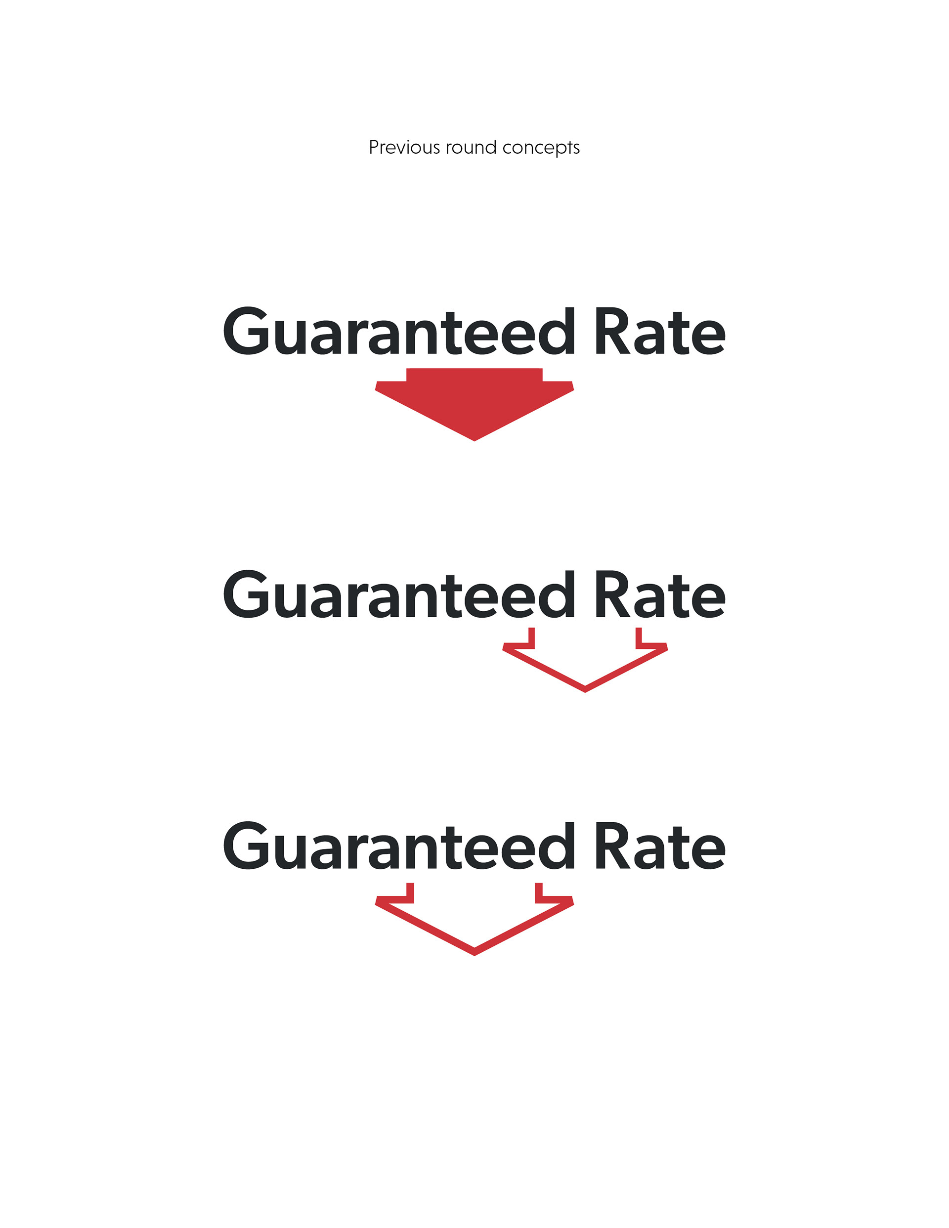
The main goal for this refresh was to even out the balance of the logo, as a common note among the creative team was that the red arrow makes the current logo feel unbalanced. This was achieved in two ways—by not only centering the arrow icon within the word mark, but also by converting the red fill to a stroked outline. Those changes preserve the integrity of the arrow icon while properly dispersing the weight across the entire graphic.
The angles of the arrow icon itself were also fine-tuned to bring more character and intentionality to the mark. Pairing these changes with a more modern typeface allows this refresh to stay reminiscent of the company’s past while staying current for a modern era.