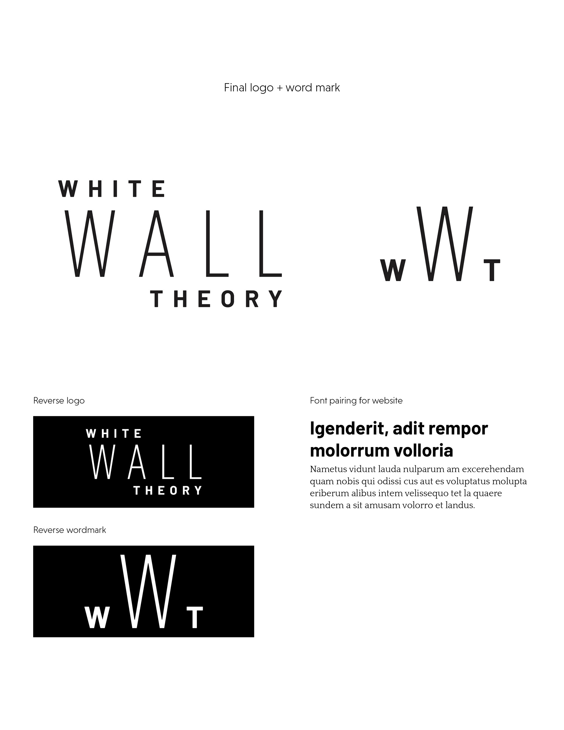
Logo, word mark and typeface pairings for an art blog, with a focus on educating readers and presenting artwork in an appealing and easily digestible format for first-time art history aficionados. The client had many different requests for this logo—they wanted the brand to feel contemporary, unique, simple and intellectual but approachable. The client was inspired by monograms and wanted the final work to contain similar details.
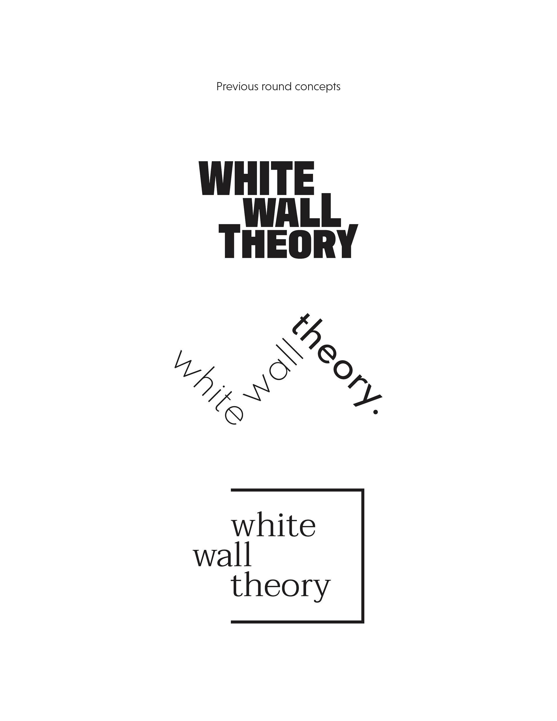
Many different logo options were considered. Some of the initial rounds of logos incorporated a lot of inter-connectivity and movement, which allowed for the logo to stand alone as a unique and engaging piece but felt a little too challenging for a brand whose goal is to encourage people to learn more about art history. The final logo blends all of the brand’s goals together—it is contemporary and clean as a way to stay sophisticated without being overly challenging or daunting. The use of multiple typefaces within the logo retains its kinetic energy and creates a unique flow for the word mark. The monogram is simple but impactful and provides a secondary branding opportunity in which it can be nestled as a watermark across different pieces of their content.